Responsive images done right
Written on 2018-03-07I want to share some thoughts on responsive images. I'll write about a certain mindset which many projects could benefit from: small- and mid-sized web projects that don't need a full blown CDN setup, but would enjoy the performance gain of responsive images.
The idea behind responsive images is simple: try to serve an image with dimensions as close as possible to the image dimensions on screen. This results in smaller bandwidth usage and faster load times!
For example: if you're displaying an image on a mobile device with a screen of 600px wide, there's no need for downloading that image with a width of 1000px.
The responsive images spec handles not only media queries, but pixel density too. The only thing the server has to do is generate multiple variations of the same image, each with a different size.
If you'd like to know more about how things are done behind the scenes, I'll share some links to interesting resources at the end of this post.
How to render responsive images
There are different ways to render variations of the same image. The simplest approach could be this: given an image, create 4 variations: 1920px, 1200px, 800px and 400px.
While this approach is easy to implement, it's not the most optimal. The goal of responsive images is to serve faster loading images while maintaining the highest possible quality for the user's screen.
There are two variables in this equation: the width of the user's screen (and therefore the width of the image itself) and the file size of an image.
Say you have two images with the exact same dimensions. Depending on the content in that image and the encoding used, their file sizes could differ a lot.
Another approach could be to manually define the most optimal srcset for each image.
This is impossible to do for most websites.
A website could have lots of images,
and it's also difficult to manually calculate the dimensions for that optimal srcset.
Luckily, computers are very good at tedious calculations on a large scale. This approach sounds like a good idea: given an image, generate x-amount of variations of that image, each variation being approximately 10% smaller in file size.
How does that sound? You now have a small margin of possible "overhead"
for variable screen sizes, but at least we're sure that margin won't be more than 10%.
Depending on the size of the image, for example: a thumbnail vs. a hero image;
we could even reduce the margin to 5% instead of 10%.
This will result in a different srcset for every image,
but that's not our concern: the responsive images spec can handle that for us.
So how can you determine the dimensions of, say 10 variants of the same image, if you only know the dimensions of the original image? This is where high school maths come into play.
We start with these known variables
filesize = 1.000.000
width = 1920
ratio = 9 / 16
height = ratio * width

Next we introduce another one: area
area = width * height
 <=> area = width * width * ratio

We say that the pixelprice is filesize / area
pixelprice = filesize / area

Now we can replace variables until we have the desired result
 <=> filesize = pixelprice * area
 <=> filesize = pixelprice * (width * width * ratio)
 <=> width * width * ratio = filesize / pixelprice
 <=> width ^ 2 = (filesize / pixelprice) / ratio
 <=> width = sqrt((filesize / pixelprice) / ratio)
This proof says that given a constant pixelprice, we can calculate the width a scaled-down image needs to have a specified filesize. Here's the thing though: pixelprice is an approximation of what one pixel in this image costs. Because we'll scale down the image as a whole, this approximation is enough to yield accurate results though. Here's the implementation in PHP:
/*
$fileSize        file size of the source image
$width           width of the source image
$height          height of the source image
$area            the amount of pixels
                 `$width * $height` or `$width * $width * $ration`
$pixelPrice      the approximate price per pixel:
                 `$fileSize / $area`
*/

$dimensions = [];

$ratio = $height / $width;
$area = $width * $width * $ratio;
$pixelPrice = $fileSize / $area;
$stepModifier = $fileSize * 0.1;

while ($fileSize > 0) {
    $newWidth = floor(
        sqrt(
            ($fileSize / $pixelPrice) / $ratio
        )
    );

    $dimensions[] = new Dimension($newWidth, $newWidth * $ratio);

    $fileSize -= $stepModifier;
}
I want to clarify once more that this approach will be able to calculate the dimensions for each variation with a 10% reduction in file size, without having to scale that image beforehand. That means there's no performance overhead or multiple guesses to know how an image should be scaled.
In practice
Let's take a look at a picture of a parrot. This image has a fixed srcset:

This one has a dynamic srcset:
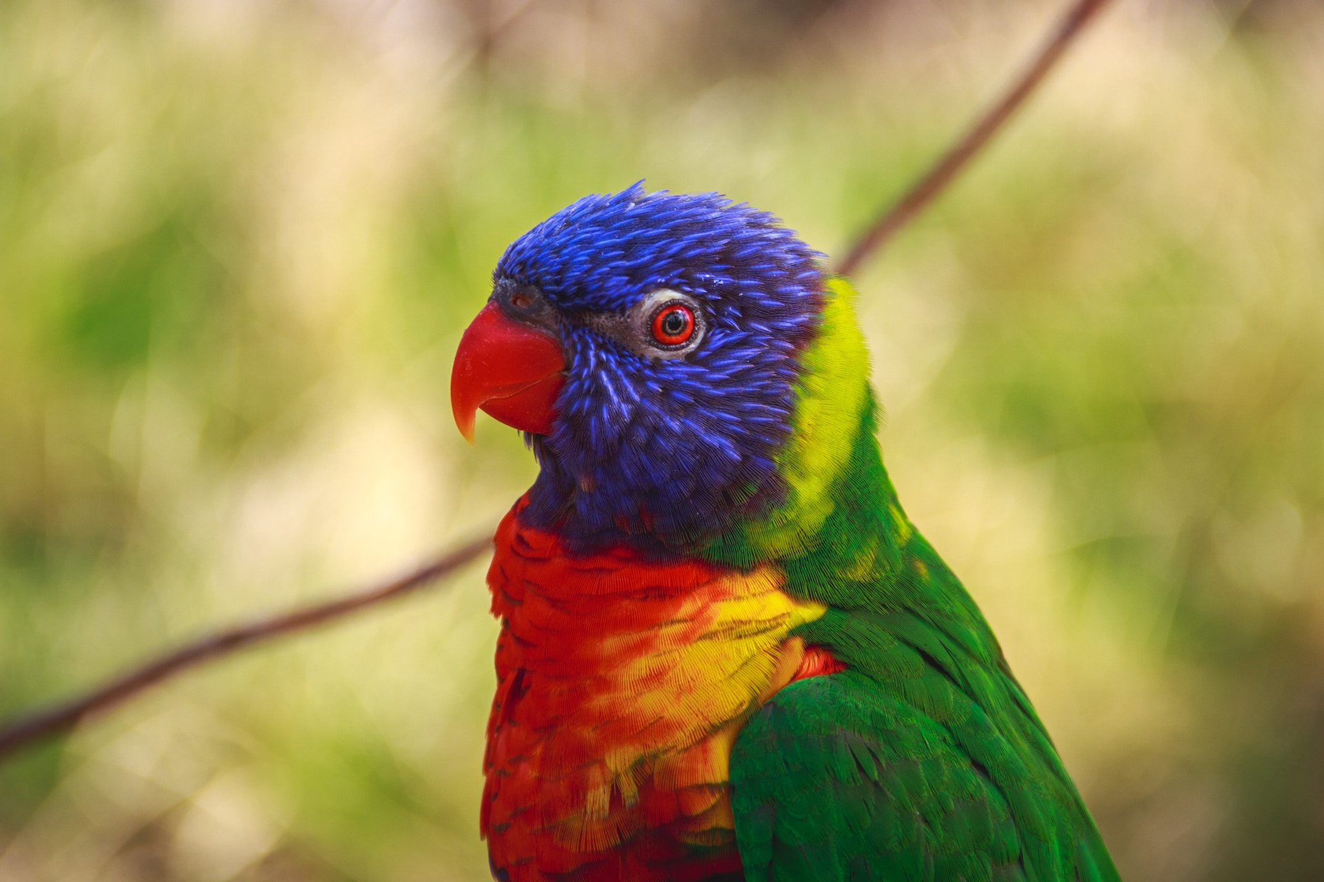
Feel free to open up your inspector and play around with it in responsive mode. Be sure to disable browser cache and compare which image is loaded on different screen sizes. Also keep in mind that the pixel density of your screen can have an impact.
Can you imagine doing this by hand? Neither can I! One of the first features I proposed when I started working at Spatie, my current job, was to add this behaviour in the Laravel media library, its usage is as simple as this:
$model
   ->addMedia($yourImageFile)
   ->withResponsiveImages()
   ->toMediaCollection();
<img
    src="{{ $media->getFullUrl() }}"
    srcset="{{ $media->getSrcset() }}"
    sizes="[your own logic]"
/>To finish off, here are the links which I mentioned at the start of this post.
- Responsive images explained in depth:
https://ericportis.com/posts/2014/srcset-sizes/ - The official specification website: https://responsiveimages.org/
Special thanks to my colleague Sebastian for reviewing and editing this post.