My IKEA clock, and software design
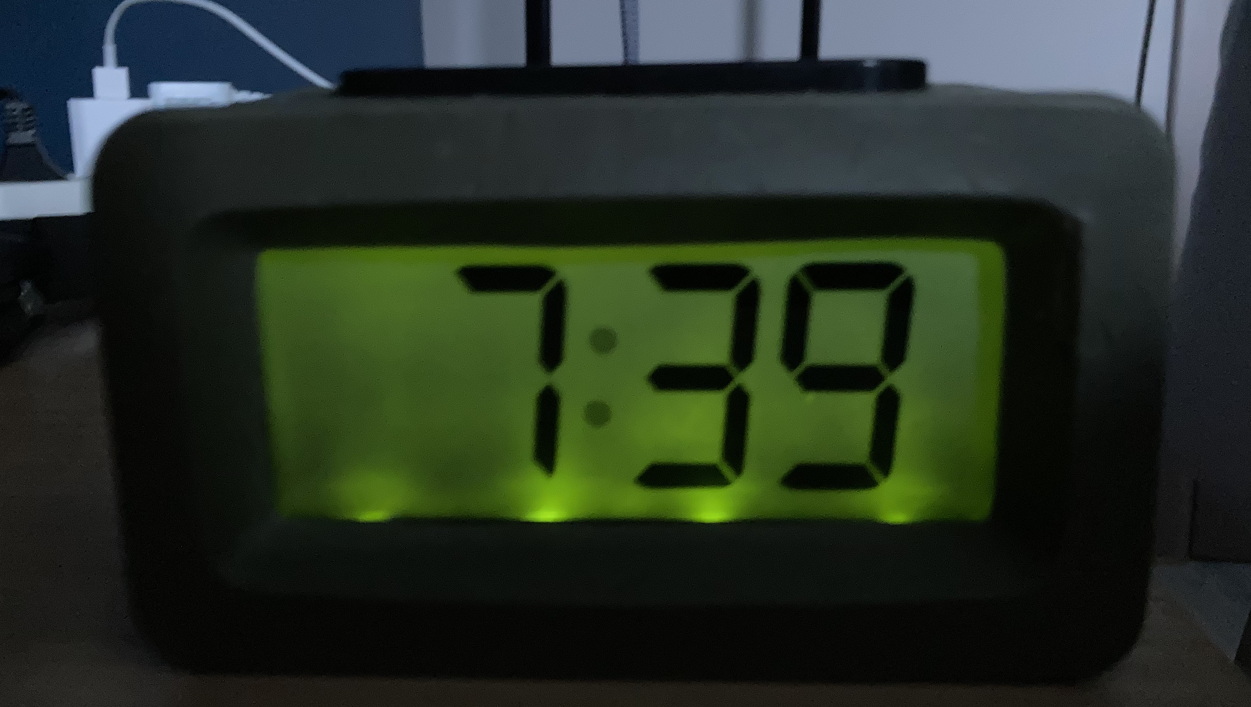
Written on 2021-09-01This is my bedside clock:

I've had this IKEA clock for 14 years now — that's half my life. And it's one of those things I'll be really sad about the day it stops working.
Why? This clock is a beautiful example of perfect design. Not because it's pretty, but because it's simple, has a clear goal, combined with extremely good UX.
- It has a very dim backlight, which only shows for a short period when you press the giant button on top. So there's no additional light in your room while sleeping.
- It's wireless, and the batteries last for years. I know for sure that I've changed its batteries once in the last 7 years, maybe once more before, but I can't remember.
- It has a rubber coating, protecting it from falls — I've actually thrown it at my brother once for waking me up too early, it kept working fine (sorry bro, we were young…).
- It keeps its internal clock state for a minute or so after removing the batteries, so you can change batteries without having to reset the clock afterwards — is this magic?
- It can change time both forwards and backwards, making it easy to set alarms without having to do the full 12-hour, 60-minute round trip.
We should design our software more like this clock. No nonsense, focussed on a clear goal and with the simplest UX possible. It just works.
Unfortunately, IKEA doesn't make this kind of clock anymore (it's called "Slabang", by the way). I really hope mine will last a few more decades; I've already been looking for replacements, but nothing seems to match the excellence of this clock.
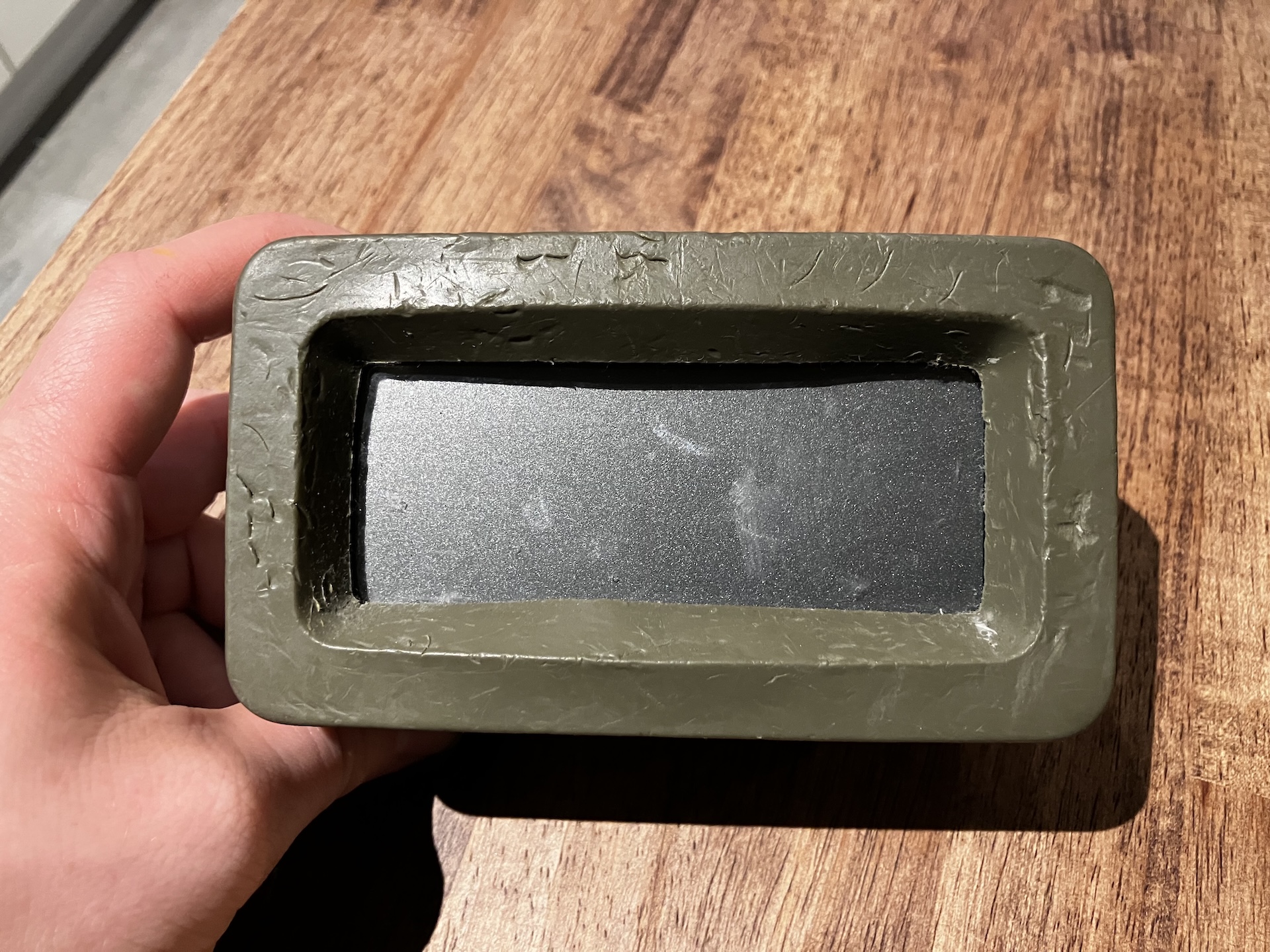
Update on April 24, 2026: yesterday, my beloved clock died. It lasted for almost two decades, so I can't complain. I have to admit I'm saddened by the loss as I doubt I can find a replacement that matches all the things I loved about it.

For those wondering: yes, those are teethmarks. Besides me throwing it at my brother 15 years ago, my clock also survived me having three kids who regularly liked to toss it around and bite it. Rest in peace.
